TL;DR
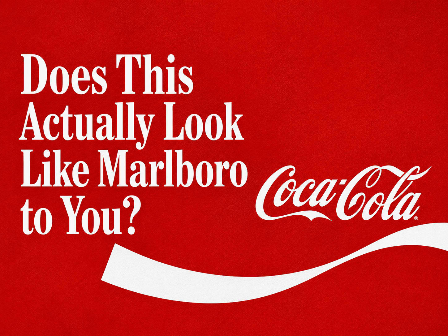
In July 2026, Coca-Cola rolled out a global rebrand, a refined Spencerian script, a bolder Dynamic Ribbon, vertical wordmarks on cans, and a new supporting typeface called "Better With" used for words like "Delicious" and "Refreshing." That typeface, rendered in red and white, looked close enough to Marlboro's font that the internet noticed within hours. "Coke and Marlboro had a baby, and it's this font," one person wrote. The twist that makes this genuinely interesting: Gen Z had already nicknamed Diet Coke a "fridge cigarette" as a joke, months before this rebrand dropped. So there were two real questions on the table, and we want your actual take on both: does the new look genuinely resemble cigarette packaging, and was Coke leaning into being a "fridge cigarette," on purpose or not?
What Actually Changed
Here's what Coca-Cola, working with agency JKR, actually rolled out. The changes are refinements, not a full reinvention: greater prominence for the red-and-white palette, a refreshed Spencerian script, a bolder Dynamic Ribbon and Arden Square, cans switching to a vertical wordmark after roughly a decade of horizontal branding, and updated Zero Sugar packaging with larger type, a black ribbon and black bottle caps. It's rolling out across more than 200 markets, starting in Latin America, Europe, the Middle East and Asia, with North America scheduled for 2027.
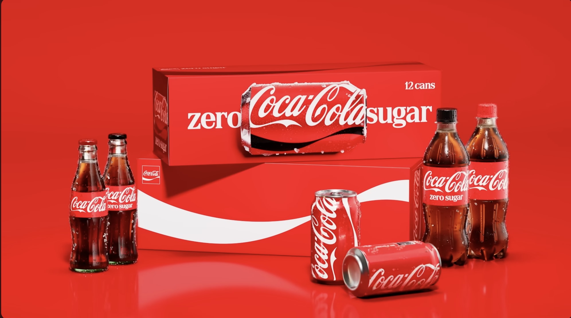
The specific flashpoint is a typeface called "Better With," created by Brody Associates back in 2023 for a holiday campaign, now elevated to a central role across all of Coke's packaging and marketing, used for words like "Delicious" and "Refreshing." It's a bold slab serif. So is the font on a pack of Marlboros. Designers who've looked closely say the two typefaces are technically distinct, from the same broad category of slab serif, not identical letterforms. But rendered in red and white, the colours both brands are built on, the resemblance is hard to unsee.
The Joke That Got There First
Here's the detail that makes this more than a simple design controversy: the internet didn't need the rebrand to make this connection. Since summer 2025, people had already nicknamed Diet Coke and Coke Zero a "fridge cigarette", a joke about reaching into the fridge for a can the same way you'd reach for a cigarette, a small, quick, slightly addictive hit.
So when the rebrand dropped on July 20, 2026, with a font that leaned into the exact aesthetic the joke was already pointing at, the internet didn't need convincing. It felt like the punchline arriving on cue. "Coke and Marlboro had a baby, and it's this font!" one person posted. Another replied, "To be fair, they're both killers, just saying." Someone else asked the question at the heart of this whole story: "Is Coca-Cola rebranding like that because we all started calling 'em fridge cigarettes???"
Two Ways to Read It
There isn't a clean answer here, which is exactly why it's worth putting to a real audience instead of declaring a verdict.
Read one: it's an unfortunate accident. Both brands lean on strong reds and whites, both favour bold serif lettering with heritage and confidence baked in, and when you're refreshing a 100-plus-year-old identity across 200 markets, some overlap with adjacent visual categories is close to inevitable. On this read, Coca-Cola simply didn't stress-test the new type against the meme that was already circulating, and got caught by a coincidence of timing.

Read two: it's the most self-aware move a sugar company could make. As one commenter put it, "Coca-Cola switching to a Marlboro font lookalike is the most self-aware thing a sugar company has ever done." On this read, Coke saw the "fridge cigarette" joke land, understood exactly what it implied, sugar as the new tobacco, small daily indulgence with a health cost, and decided to lean in rather than run from it, since jokes people already believe are harder to argue with than jokes you have to plant yourself. The timing is genuinely awkward too, given the UK and other markets pushing sugar taxes on soft drinks, which makes the cigarette echo land even sharper.
There's a second, quieter debate buried in here too: several people online pointed out that the new typeface makes it genuinely harder to tell Coke Zero from regular Coke at a glance, which stopped being a design nitpick the moment someone raised diabetes and quick-glance grocery decisions. That's a real, practical concern sitting right next to the meme conversation.
We Want to Know What You Actually Think
This is the kind of story where the "right" answer is genuinely split, design experts, the internet, and Coca-Cola itself all seem to be reading the same rebrand differently. So rather than hand you a verdict, here are the two questions actually worth arguing about:
Does the new Coca-Cola look genuinely resemble cigarette packaging to you, or is this an internet pattern-match on two brands that both happen to use red, white, and confident serif type?
And separately: what do you make of Coke being called a "fridge cigarette"? Funny and fair? A little too accurate for comfort? Or completely unrelated to how you actually experience the drink?
Neither question has an obvious right answer, and that's exactly why this is more interesting than most rebrand stories. Tell us where you land.
Frequently Asked Questions
Why does Coca-Cola's new rebrand look like Marlboro?+
The controversy centres on a new supporting typeface called "Better With," a bold slab serif used for words like "Delicious" and "Refreshing." Rendered in Coca-Cola's signature red and white, it visually resembles Marlboro's typeface, even though designers say the two fonts are technically distinct.
What is a "fridge cigarette"?+
A Gen Z internet joke, dating to around summer 2025, referring to grabbing a can of Diet Coke or Coke Zero from the fridge the same reflexive, small-hit way someone might reach for a cigarette. The nickname existed before this rebrand and is widely seen as the reason the Marlboro comparison spread so fast.
Is the Marlboro resemblance intentional?+
Coca-Cola hasn't confirmed either way. Some read it as an unintentional overlap given both brands share red-and-white branding and bold serif type traditions. Others read it as a deliberate, self-aware nod to the "fridge cigarette" joke already circulating online.
What else changed in Coca-Cola's 2026 rebrand?+
Beyond the typeface, updates include a refined Spencerian script, a bolder Dynamic Ribbon and Arden Square, a switch to vertical wordmarks on cans, and new Zero Sugar packaging with a black ribbon and black caps. It's rolling out across 200-plus markets, with North America scheduled for 2027.
Has this caused any practical complaints beyond the Marlboro comparison?+
Yes. Several people have noted the new type system makes it harder to distinguish Coke Zero from regular Coca-Cola at a quick glance, which some have flagged as a real concern for people managing sugar intake or diabetes.
Written by

I’m Ramaa, a writer and creator at Scribble. I’ve written two books, and writing is something I always find my way back to, whether that’s articles, scripts, captions, or overly long notes app rambles I swear will “be useful later.” I enjoy thinking about why people create, how ideas spread online, and what makes content feel genuinely human. When I’m not writing, I look after regulatory compliance and legal admin at Scribble, and I’m a graduate of the School of Policy, New Delhi. Outside of work, I’m a musician and an avid reader.