TL;DR
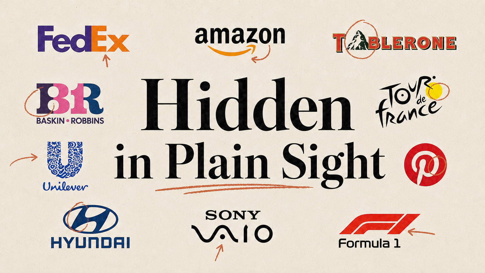
Some of the most famous logos in the world are hiding a second image in plain sight: an arrow, an animal, a smile, a cyclist. Most people never notice, and that's exactly why they work. A hidden detail rewards the person who spots it with a tiny hit of "oh, clever," and that feeling is what makes a logo stick, get shared, and get loved. Here are nine of the best, what each one is really showing you, and the design lesson underneath: the strongest marks say two things at once.
First, the point
These aren't happy accidents. A great logo does a sneaky thing: it delivers the obvious message everyone sees, and then hides a second one that only reveals itself on a closer look. When you finally spot it, you feel clever, and you remember the brand for making you feel that way. That little "aha" is one of the most powerful and underused tools in branding. So let's go looking.
The nine
1. FedEx, the arrow you can't unsee
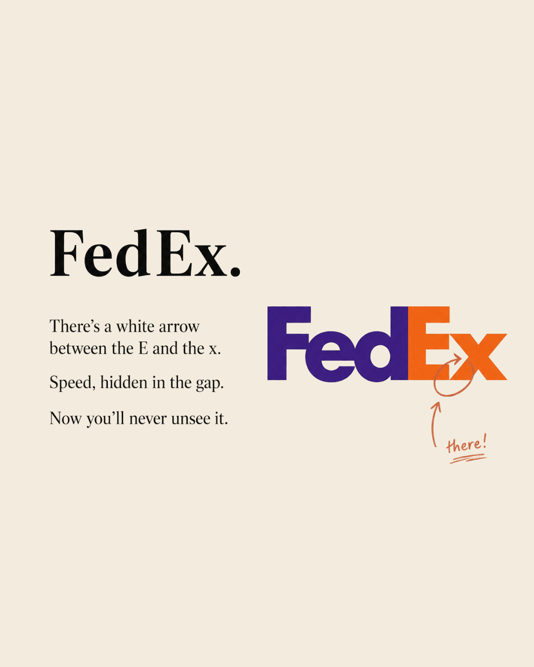
Look at the space between the "E" and the "x." There's a perfect white arrow hiding in the negative space, pointing forward. It was designed in deliberately, and it quietly says speed, precision, forward motion, everything a delivery company wants you to feel. Once you see it, you will never not see it. That's the gold standard of hidden-detail design.
2. Amazon, from A to Z (and it's smiling)
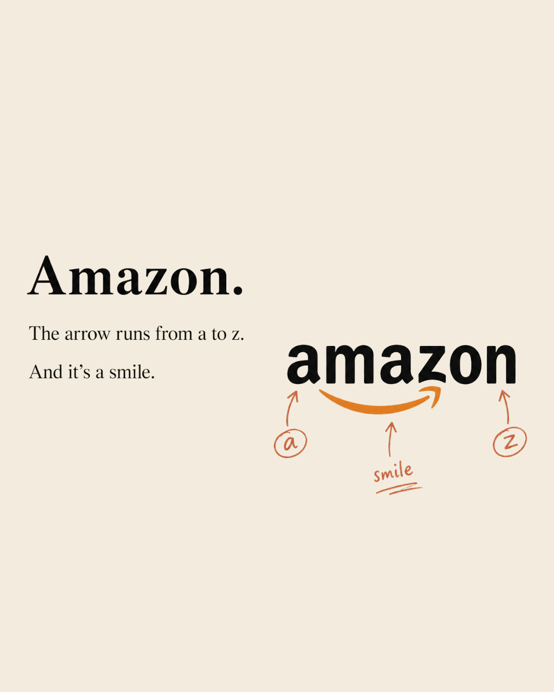
The arrow curving from the "a" to the "z" does double duty. It literally connects A to Z, meaning Amazon sells everything, and it forms a smile, the satisfied customer. Two ideas, one little swoosh. Deceptively simple, genuinely brilliant.
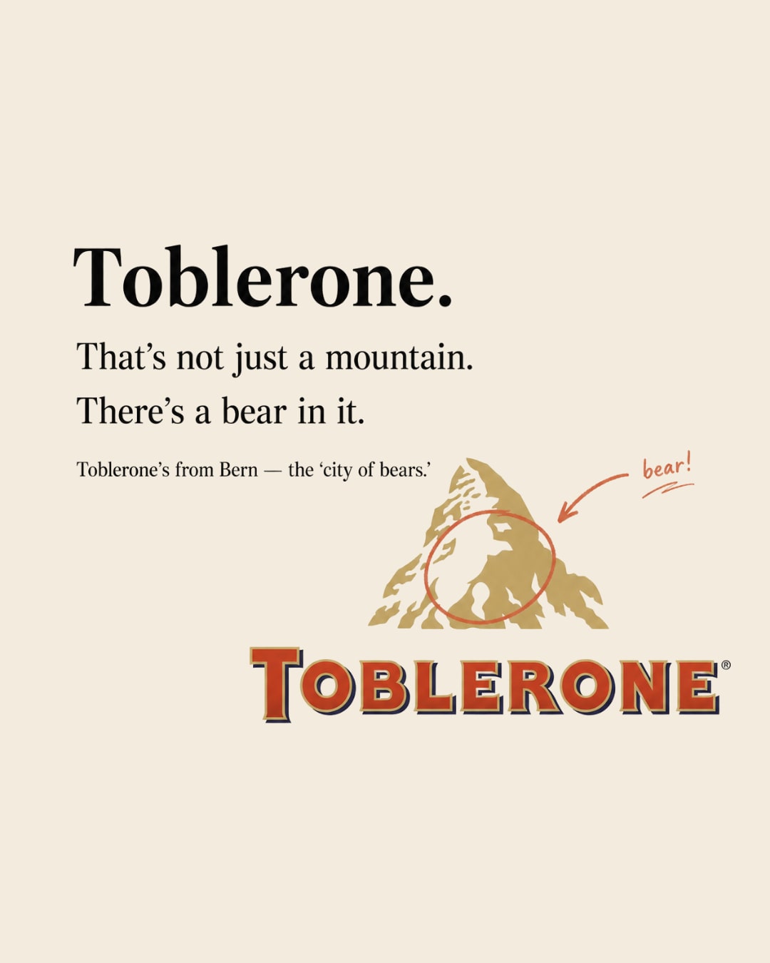
3. Toblerone, there's a bear in the mountain
That's not just the Matterhorn. Look inside the mountain and you'll find the silhouette of a bear standing up. Toblerone comes from Bern, Switzerland, known as the "city of bears," so the bear is a hidden signature of where it's from. A whole origin story tucked into a mountain.
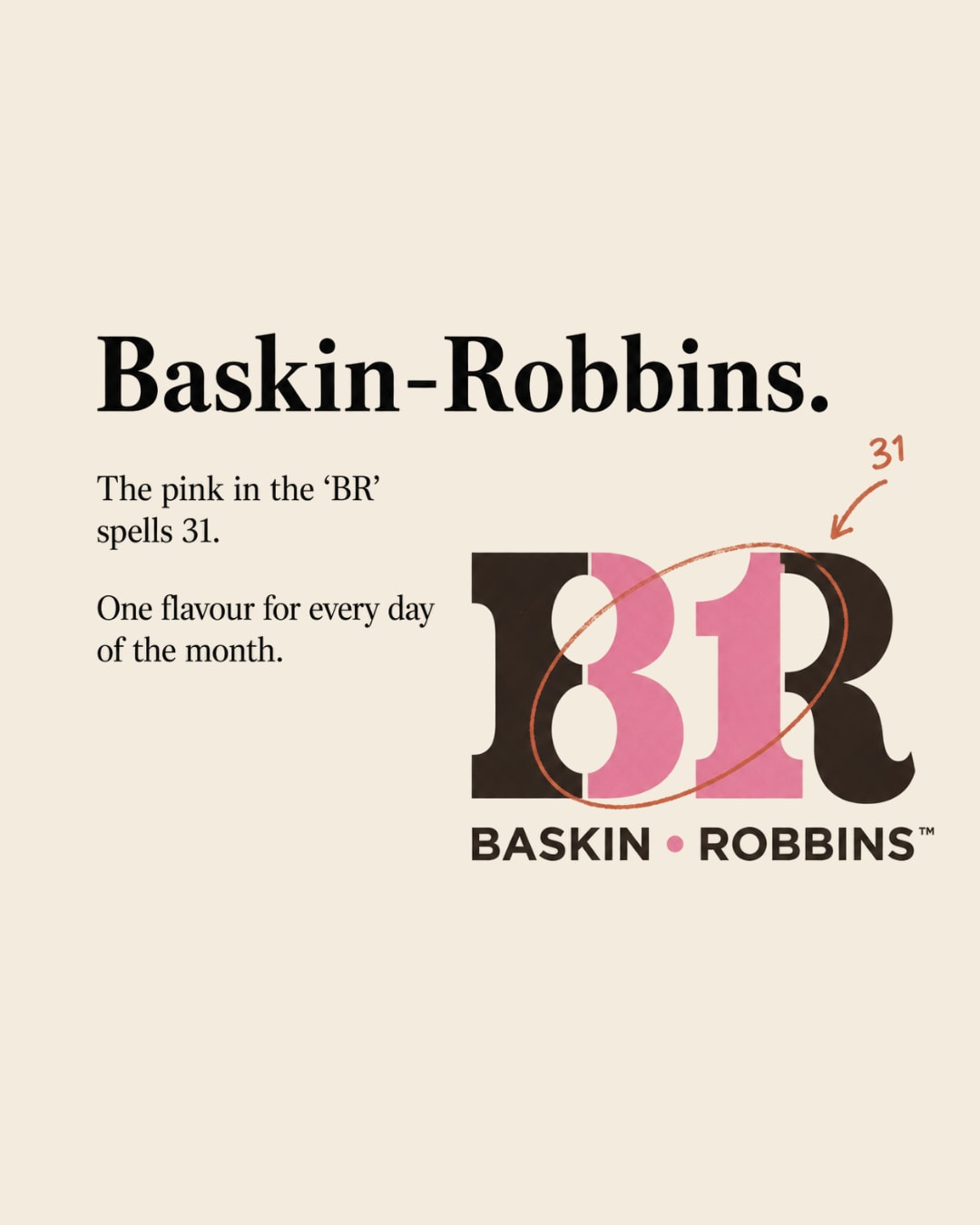
4. Baskin-Robbins, the number in the name
Look at the pink parts of the "BR." The bits of the B and the R form the number 31, for Baskin-Robbins' famous 31 flavours, one for every day of the month. A brand promise, hidden inside the initials.
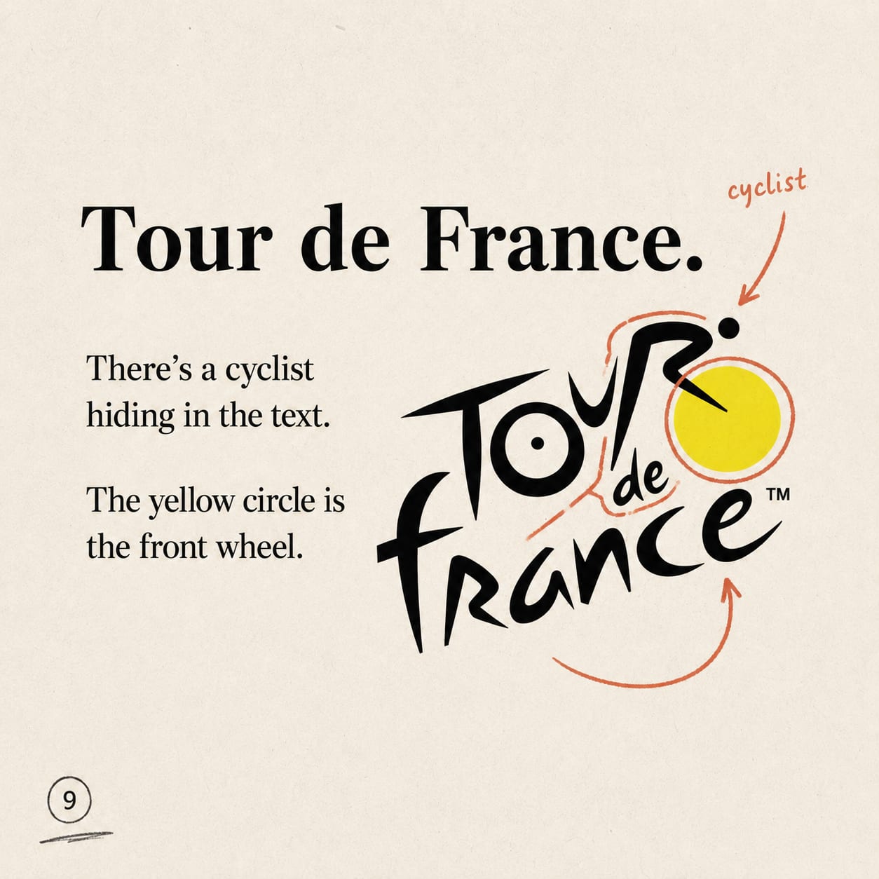
5. Tour de France, the cyclist in the type
In the "Tour de France" wordmark, the "R," combined with the yellow circle (the "o") and a swoosh, forms a cyclist riding a bike, with the yellow dot as the front wheel and the sun. A moving athlete, hidden in the letters of the name.
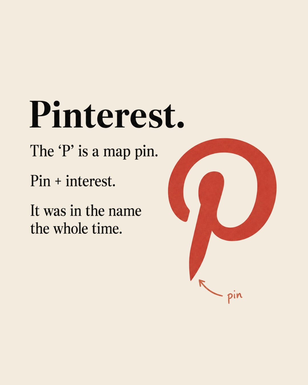
6. Pinterest, the pin was there all along
The "P" isn't just a P. It's a map pin, the little location marker, because Pinterest is where you "pin" the things you're interested in. The name and the icon are the same idea, folded together. Pin + interest. Pinterest.
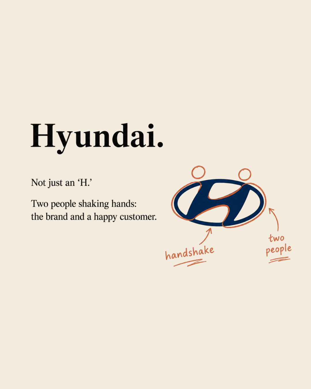
7. Hyundai, a handshake, not just an H
The slanted, stylised "H" isn't only the initial. It's two figures shaking hands, the company on one side and a satisfied customer on the other. A logo about the relationship, disguised as a letter.
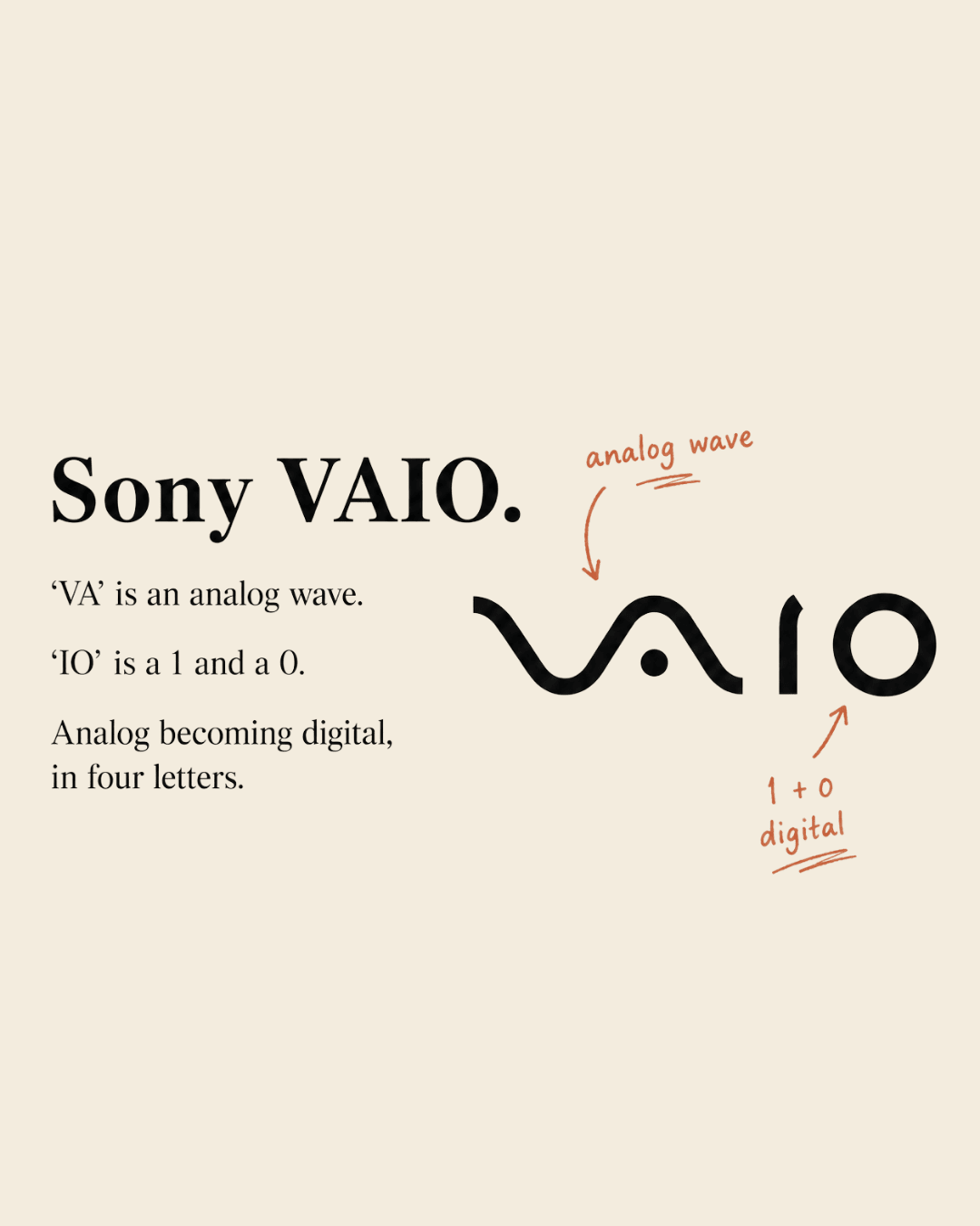
8. Sony VAIO, analog becomes digital
The "VA" is drawn as an analog wave form, and the "IO" is styled as a 1 and a 0, the binary of the digital world. The whole logo tells the story of analog signal turning into digital, in four letters. Deeply nerdy, deeply clever.
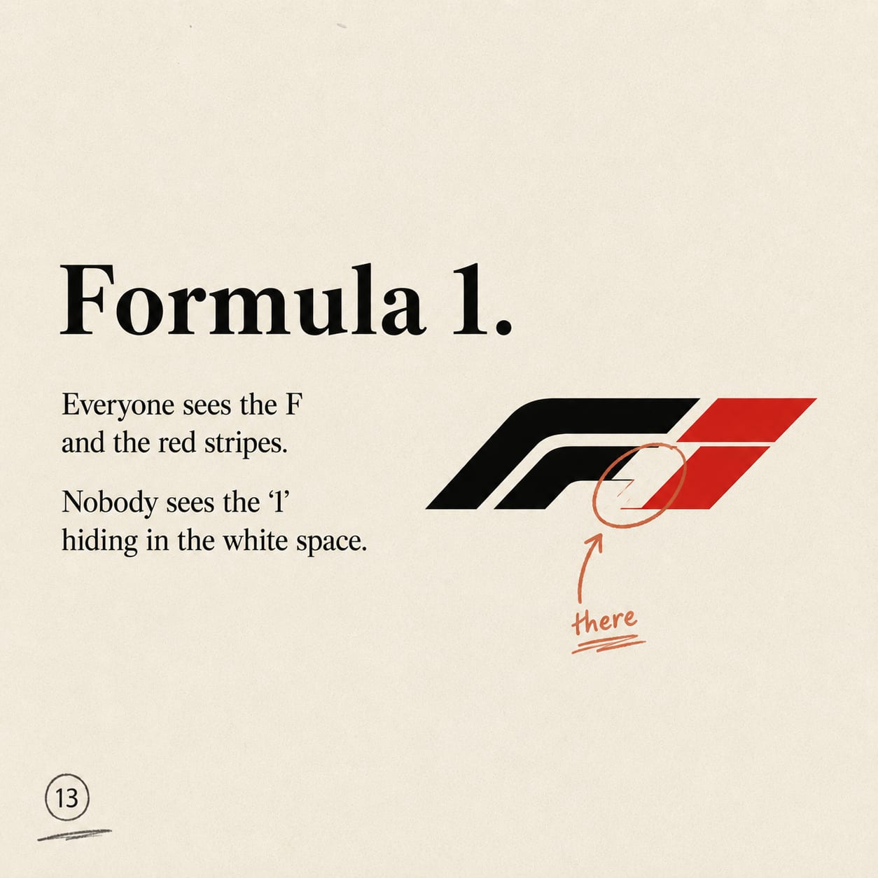
9. Formula 1, the "1" you never noticed
In the old F1 logo, everyone sees the black "F" and the red racing stripes. But the white negative space between them forms the number 1. The speed lines aren't just decoration, they're hiding the "1" in Formula 1.
Why the secret works
Here's the mechanism, and it's worth stealing.
A hidden detail turns a passive glance into an active discovery. Instead of just receiving the logo, you find something in it, and finding feels good. That tiny reward does three things at once: it makes the logo more memorable (you remember what you discover far better than what you're told), it makes you feel smart (which you associate with the brand), and it gives you something to share ("wait, have you seen the arrow in the FedEx logo?"). A secret is inherently spreadable, because telling someone makes you the clever one too.
That's the real lesson. The best marks don't just look nice. They give you a job, spot the thing, and reward you for doing it. In a world where most design is trying to grab your attention for a second, a hidden detail earns a second look, and a second look is worth a hundred glances.
Tips to steal
Say two things at once. The obvious message for everyone, and a hidden one for the people who look closer. The second layer is what earns loyalty.
Use the negative space. The FedEx arrow, the F1 "1", the Pittsburgh Zoo animals, all of them live in the gaps. The empty space is real estate.
Reward the discovery, don't explain it. The magic dies the moment you point at it in the ad. Let people find it. The finding is the whole gift.
Make the secret mean something. The bear is Bern. The smile is the customer. A hidden detail lands when it's true to the brand, not just a clever trick.
You've walked past these logos ten thousand times. The genius is that they were talking to you the whole time, on a second frequency you only tune into when you finally look closely.
That's the trick worth remembering.
The best design doesn't shout the message. It hides a second one, and lets you feel clever for finding it.
Frequently Asked Questions
What is the hidden detail in the FedEx logo?+
There's a white arrow in the negative space between the "E" and the "x," pointing right. It was designed in deliberately to suggest speed and precision.
What does the Amazon arrow mean?+
It points from the "a" to the "z," signalling that Amazon sells everything from A to Z, and it also forms a smile representing customer satisfaction.
Why is there a bear in the Toblerone logo?+
Toblerone is from Bern, Switzerland, known as the "city of bears." A bear is hidden inside the Matterhorn mountain silhouette as a nod to its home.
What is hidden in the Baskin-Robbins logo?+
The pink portions of the "BR" form the number 31, representing the brand's original 31 flavours, one for each day of the month.
Do brands hide these details on purpose?+
The best-known ones, yes, they're deliberate design choices. Some "hidden meanings" that circulate online are later inventions or myths, but the ones in this list were intentionally built in.
Why do hidden-detail logos work so well?+
Because discovering the secret rewards the viewer with a small "aha," which makes the logo more memorable, makes people feel clever, and gives them something worth sharing.
Written by

I’m Ramaa, a writer and creator at Scribble. I’ve written two books, and writing is something I always find my way back to, whether that’s articles, scripts, captions, or overly long notes app rambles I swear will “be useful later.” I enjoy thinking about why people create, how ideas spread online, and what makes content feel genuinely human. When I’m not writing, I look after regulatory compliance and legal admin at Scribble, and I’m a graduate of the School of Policy, New Delhi. Outside of work, I’m a musician and an avid reader.