TL;DR
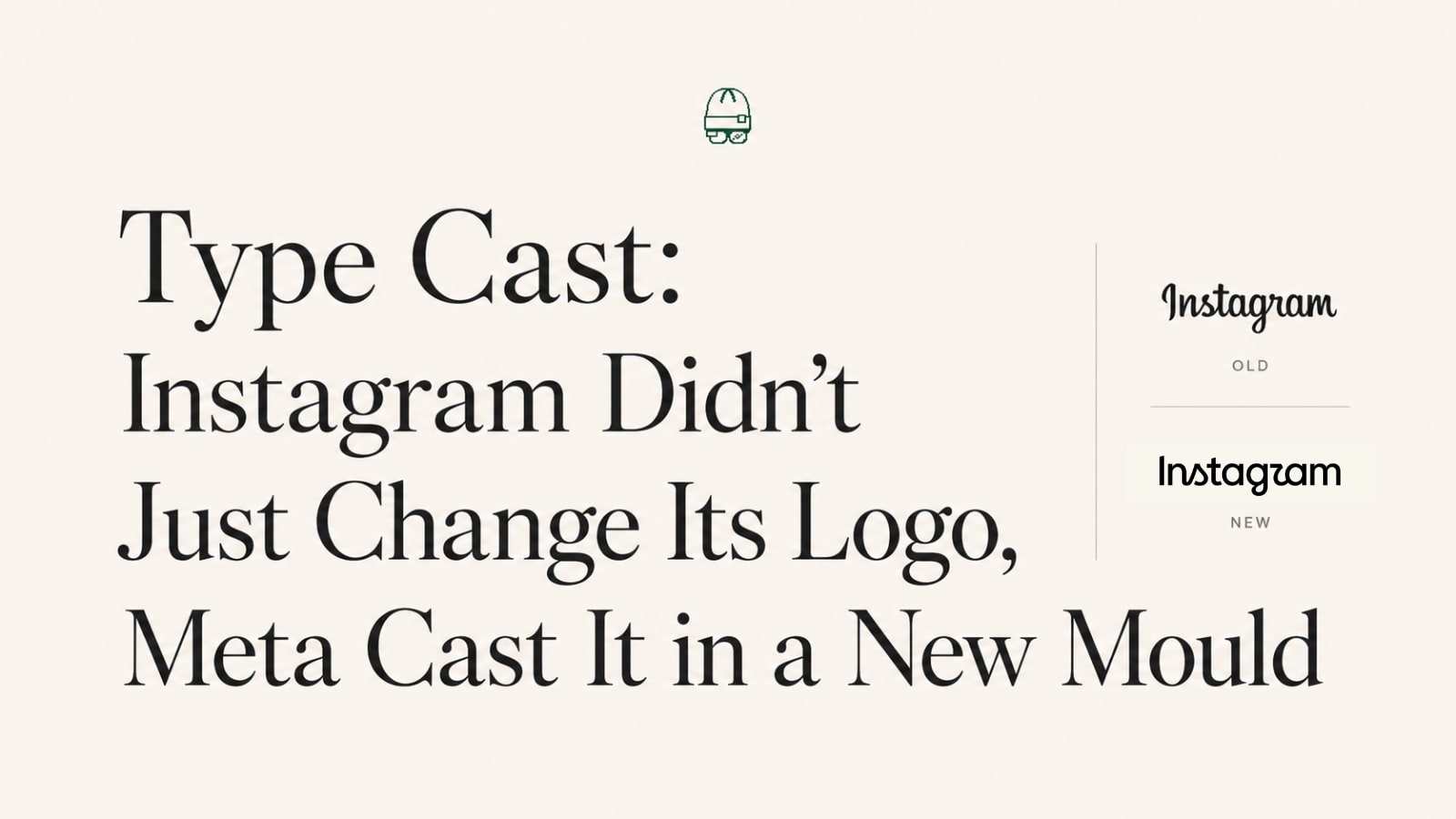
On August 13, 2026, Instagram swapped the bouncy, handwritten-looking wordmark it's had since 2016 for something more compact, bolder, and tightly drawn. The internet immediately nicknamed it "Instagzam" because the new "r" looks like a "z." But the logo is the least interesting part. Underneath it, Meta rolled out a whole typographic system: three coordinated font families, a dialed-back gradient, and a look that deliberately matches Facebook and Threads. This isn't Instagram getting a makeover. It's Meta quietly casting all its apps in the same mould, and trading a little personality for a lot of consistency.
What Actually Changed
Here's the setup. Instagram head Adam Mosseri unveiled the new wordmark on Instagram and Threads, calling it cleaner, sharper, and more modern. It's the first change to Instagram's brand typography in about ten years.
The what: the "Instagram" text at the top of the app moved from a casual, loose, handwritten italic to a more compact, bolder letterform with more tightly connected letters. The "s," "r," and "g" got rounder, and the "r" changed enough that people online now read the whole thing as "Instagzam," with a few comparing the new "s" to a little sailboat.
The what didn't: the pink-orange gradient camera icon on your home screen is untouched. But this part matters: Instagram says that signature gradient will now be used more sparingly across the brand going forward.
The why: officially, the old type had simply aged after a decade. With around 3 billion monthly users, this is a mark most of the planet sees daily, so the ripple runs from the home screen to every ad and press asset.
The when: a gradual, phased rollout across the app, website, and official materials through the rest of 2026.
The Reaction: "Instagzam"
A wordmark tweak became a two-day debate because of how it felt, not how it reads.
The loudest note was loss. For ten years that slightly wobbly, hand-drawn script was the visual equivalent of the app's early personality: casual, human, a little scrappy. Tightening it into something bolder and more corporate reads, to a lot of people, like watching a friend show up to the reunion in a suit.
Then came mockery, which is just affection wearing a mean hat. "Instagzam," the sailboat "s," people don't roast a logo they feel nothing about. The jokes are the tell that the mark still matters.
There's also a theory making the rounds that's worth flagging precisely because it's wrong in a useful way. One viral post joked that Instagram killed the cursive wordmark because Gen Z can't read cursive, stacking up real "Gen Z killed cursive" headlines as mock evidence. As a fact it falls apart, and the replies said why: it confuses Gen Z with little kids, the oldest Gen Z is nearly 30, and vanishing cursive is largely a US curriculum quirk while much of the world still teaches it. But as a joke it accidentally points at the real reason, which has nothing to do with age and everything to do with legibility.
And underneath both, a quiet unease that's hard to name until you see all the pieces together. Something about it feels less like Instagram and more like a Meta product. Which, as we'll see, is exactly right.
The Real Story: One Meta, One Type System
Here's the part the logo jokes are burying.
This isn't a single new font. The refresh ships three coordinated typeface families: a revised Instagram Sans, a handwritten Instagram Pen, and a monospace Instagram Mono. Pause on that trio. A workhorse sans, an expressive script, and a mono for code and data. That's not the toolkit of a photo-sharing app. That's the standard shape of a software company's type system, the same functional set you'd expect from a serious tech platform. A mono on its own proves nothing, since plenty of brands keep one for captions and numbers. It's the full set, sans plus script plus mono, that reads as a tell rather than a coincidence. Meta is dressing Instagram like infrastructure.
Now add the two moves around it. The gradient, Instagram's most flamboyant and most recognizable asset, is being turned down. And the new wordmark was explicitly designed to sit closer to the updates Meta already rolled out for Facebook and Threads.
String those together and the picture is obvious. This is brand unification. Meta is pulling three separate app identities toward one shared, in-house, functional system: same type logic, same restrained use of colour, same grown-up tone. The Instagram logo didn't just get modernized. It got assimilated.
Why Meta Wants This
Unifying a brand system is one of the least glamorous and most powerful moves a company can make. The payoff:
Consistency at absurd scale. Across billions of users and thousands of surfaces (apps, ads, press, hardware, AI features), one system means everything looks intentional instead of improvised.
Ownership and control. Bespoke, in-house type families mean no licensing fees and no third-party constraints as the brand expands into new languages and products.
Multilingual reach. A purpose-built family can be engineered to work across global scripts, which a decade-old custom script wasn't designed to do.
Legibility over charm. A cursive script is decorative and human, and it's also harder to read at small sizes, across languages, and on every screen a global brand touches. A more upright, tightly drawn letterform trades a little personality for readability, and a system meant to be read everywhere can't keep paying that tax.
Cross-app gravity. When Instagram, Facebook, and Threads share a visual language, moving between them feels seamless, and the whole Meta ecosystem reads as one connected place. That's exactly what Meta wants you to feel.
A more "serious" identity. As Meta pushes into AI, hardware, and enterprise, the playful hand-drawn era doesn't fit the story it's telling investors and partners. A cleaner system signals maturity.
What It Costs
But unification is never free, and it's worth naming the bill.
The thing you spend is distinctiveness. Instagram's wobbly script was inefficient and outdated, and it was also unmistakable. You could feel the brand before you read the word. A tighter, more systematic wordmark is more scalable and more forgettable, and the "Instagzam" jokes are really people mourning a personality, not critiquing an "r."
There's a bigger risk, too: convergence. When every Meta app is cast in the same type, the same restrained palette, the same tone, the apps start to feel like one app. Sameness is efficient. It's also how distinct products quietly dissolve into a single beige mega-brand. The question Meta is betting on is whether users want a coherent family or a house full of individuals.
Tips to Steal From This Story
A brand system is a scale decision, not a taste decision. When you're everywhere, consistency stops being nice-to-have and becomes operational survival.
Build a type family as a system, not a font. Sans for work, script for warmth, mono for data. Plan for every job the brand will need, not just the logo.
Distinctiveness and consistency are a trade, so choose deliberately. Every point of polish you add usually costs a point of personality. Know which one your brand can't afford to lose.
Own your assets. In-house type means no licensing ceiling as you expand into new languages, products, and markets.
Watch for convergence. If your sub-brands start looking identical, you gained efficiency and may be quietly erasing the reasons people chose each one.
Instagram's old logo was drawn to look like a person wrote it. The new one was drawn to look like a system generated it. That's the whole story in one line.
The wordmark is smaller news than it looks. The system behind it is bigger:
Meta isn't refreshing three apps. It's slowly making them one.
Continue Reading
On X: the contrarian cut, why this is Meta quietly turning three apps into one here.
On LinkedIn: the strategy lens, the business case for trading brand personality for a system, here.
On Instagram: the 60-second before/after, here.
Frequently Asked Questions
What changed in Instagram's new logo?+
The wordmark, meaning the "Instagram" text at the top of the app, moved from a loose, handwritten italic to a more compact, bolder, tightly connected letterform, with rounder "s," "r," and "g." The gradient camera icon is unchanged, though the gradient will be used more sparingly across the brand.
Why does the new Instagram logo say "Instagzam"?+
It doesn't. The redesigned "r" is drawn so differently that at a glance it reads like a "z," which is why the "Instagzam" joke took off online.
Did the Instagram app icon change?+
No. The pink-orange gradient camera icon introduced in 2016 stays the same. Only the text wordmark changed.
When is the new logo rolling out?+
Gradually through the rest of 2026, across the app, the website, and official brand materials, so you may not see it yet.
Is this just a logo, or something bigger?+
Bigger. The refresh includes three typeface families, Instagram Sans, Instagram Pen (handwritten), and Instagram Mono (monospace), and was designed to align with Meta's updates to Facebook and Threads, part of a broader brand-unification effort.
Why did Instagram change its typography after ten years?+
Officially, the old type had aged. Strategically, it's about consistency at scale, owning its type assets, supporting global languages, and pulling Instagram's identity closer to the rest of the Meta family.
Are people happy with the redesign?+
Reactions are mixed. Some find it cleaner and more modern, others miss the playful, hand-drawn character of the old script.
Written by

I’m Ramaa, a writer and creator at Scribble. I’ve written two books, and writing is something I always find my way back to, whether that’s articles, scripts, captions, or overly long notes app rambles I swear will “be useful later.” I enjoy thinking about why people create, how ideas spread online, and what makes content feel genuinely human. When I’m not writing, I look after regulatory compliance and legal admin at Scribble, and I’m a graduate of the School of Policy, New Delhi. Outside of work, I’m a musician and an avid reader.